Greeting cards
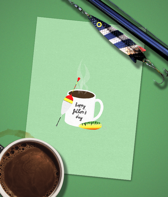
A set of greeting cards for various occasions by imagined company minimax. Due to my past experience working in a gift shop, I was always surrounded by greeting cards of all different types and styles. Most of the ones that I saw were loud and heavily designed, so I wanted to add more minimalistic variety.
zerocalcare
Microsoft Sans Serif
Project: Product and logo design
Project Type: Personal
Dimensions: 4x6"
Software: Illustrator, Photoshop
Font

Whenever I looked at the shelves in the store, there was always so much to look at or all the colours would meld together making it hard to differentiate the cards from one another. I wanted to create a set of cards that exemplified the feeling of the season or event for which the card would be used for whilst maintaining a simplistic look. With a lot of white space and a focal point for the viewer, it is immediate what occasion the card would be used for. This also improves readability from a distance since each card is given a unique coloured background making it easy to differentiate them from one another. Bright, pastel colours help define the style direction as being joyful and refreshing to look at — which helps with the problem of a cluttered presentation.